
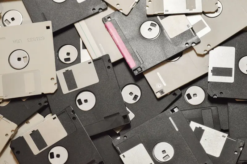
Open almost any document editor, spreadsheet, or drawing program and the button for saving your work is a small square with a notch at the top and a label area below. It is a picture of a 3.5-inch floppy disk, a storage device that vanished from mainstream use decades ago. Many people who click it every day have never handled the object it depicts.
The explanation involves two things that seem unrelated at first: the physics of magnetic storage, and the habits of interface design. The floppy was once the ordinary way to keep data, so software about saving files naturally used its image. Then the image stopped being a picture and became a word in a visual vocabulary.
What a Floppy Disk Actually Was
A floppy disk is a thin, flexible circular sheet of plastic, coated with a magnetic material, sealed inside a protective cover. A drive spins the sheet while a read-write head rides against its surface. To write, the head produces a small magnetic field that aligns tiny regions of the coating in one of two directions. To read, the head detects those changing orientations as the surface passes by and converts them into a stream of ones and zeros.
The data is arranged in concentric rings called tracks, which are divided into sectors. That arrangement lets the drive move the head to a specific ring and wait for the wanted sector to rotate underneath. Because the disk could be removed, a single drive could read many different disks, which was a large practical advantage over fixed storage.
The word "floppy" describes the flexible medium. A hard disk uses a rigid platter, while the floppy's sheet bends easily. That flexibility made the medium cheap to manufacture and easy to handle, and the same soft jacket that protected it also set the design of early drives.
The Origin at IBM
According to the Computer History Museum, IBM engineers developed the floppy in 1971 to solve a specific problem: preserving data when power was removed. The company's System/370 computer lost its microcode, the low-level instructions that guide the machine, when it was switched off. It needed an inexpensive medium to reload that code at startup.
The original disk was 8 inches wide, made of flexible Mylar, and held roughly 80 kilobytes. Inside its jacket was a soft wipe that reduced wear on the surface. It was designed as a maintenance and loading device, not as a personal storage system.
Alan Shugart, who spent eighteen years at IBM and contributed to a long line of disk drive programs, later carried the idea outward. After leaving IBM for Memorex, he founded Shugart Associates in the early 1970s and led the effort to perfect the eight-inch drive as a mass-produced device. The company introduced an 8-inch floppy drive in 1975 and, in 1976, announced the 5.25-inch "Minifloppy," which held 110 kilobytes. The smaller drive was a lower-cost design requested by Wang Laboratories, and its adoption grew when the CP/M operating system was ported to the format.
The 3.5-Inch Disk Takes Over
The next step was the 3.5-inch format. In 1982 an industry committee agreed on a specification based on a design from Sony. The disk sat in a rigid plastic case with a sliding metal shutter that covered the opening where the head reads the surface. The hard case protected the media from fingers and dust, and the shutter meant that nothing touched the sensitive area unless the disk was inside a drive.
Later versions of the format reached 1.44 megabytes. That is small by current standards, but it was enough for text documents, spreadsheets, and small programs at the time. By the mid-1990s the 3.5-inch disk dominated the market. Personal computers such as the original Macintosh, introduced in 1984, used it as a standard component. The name "floppy" persisted even though the flexible sheet inside was now hidden in a rigid shell.
The 3.5-inch disk is the version pictured in software. Its recognizable features, a metal shutter at the top and a paper label below, translate neatly into a simple icon of a square with a rectangle in each of two positions.
Why Software Borrowed the Picture
When graphical interfaces spread in the 1980s and 1990s, designers needed pictures for commands. Choosing images that people already knew reduced the effort of learning. A folder icon suggested a container for documents, a trash can suggested deletion, and a diskette suggested storing something on a disk.
This approach is called skeuomorphism: a design keeps the appearance of an older object even though the new tool works differently. The save icon is one of the most durable examples. A floppy disk was the thing you put your work on, so its picture became the button that recorded your work.
The important step happened afterward. As storage moved to hard drives, network drives, USB memory, and then remote servers, the physical disk faded from daily life, but the button remained. Interface conventions are sticky because changing them forces users to relearn something that already works. Users learned "this picture means save" and stopped needing the original object to interpret it. The symbol had detached from its referent and become a sign that stands for an action.
This pattern resembles other inherited conventions, such as the arrangement of keys described in Why Keyboards Use the QWERTY Layout. In both cases, a choice made for one physical context survived because millions of people learned it.
Everyday Examples of the Same Effect
The floppy is far from alone. A telephone handset appears on the button for calling, even though most phones no longer resemble it. A camera app makes a shutter sound copied from mechanical cameras. A magnifying glass means search, and a clipboard, envelope, or bell represent functions that have little to do with the original objects.
Touch interfaces also carry some of these habits forward, though their underlying mechanisms are entirely different. For a look at how a screen registers a tap on a symbol like this, see How a Touchscreen Detects Your Fingers. The icon itself is only an image, and pressing it triggers the same software command whether the file goes to a local drive or to a server far away.
Limitations and Misconceptions
A common misconception is that the floppy icon means that the file goes to a floppy disk. It does not; modern save commands write to whatever storage the software and system select. Another belief is that the icon persists because designers are lazy. In practice, a familiar symbol has real value. Replacing it would require a new symbol that people recognize without a label, and there is no obviously better candidate.
The icon also gets some things wrong. A save command in many current applications runs automatically in the background, so the button matters less than it once did. And the floppy suggests that data lives on a small removable object, while today's files are often spread across services, caches, and copies. Even so, most users understand the picture instantly, which is the practical test of a good interface symbol.
Popular ideas about technology often persist in a similar way, with an origin in something true that later became detached from its context. Common Tech Myths Explained with Evidence examines several of them.
In Short
The save icon is a picture of the 3.5-inch floppy disk, a device descended from the 8-inch disk that IBM developed in 1971 to reload a computer's start-up code. Interface designers used the image because the floppy was where people kept their work. When the hardware disappeared, the picture stayed, and it became a symbol that means an action rather than an object.